Creating Immersive Virtual Landscapes
eCAADe 41, 2023, pp. 149–158 · Unreal Engine 4.27 · Oculus Quest 2 · depth perception research
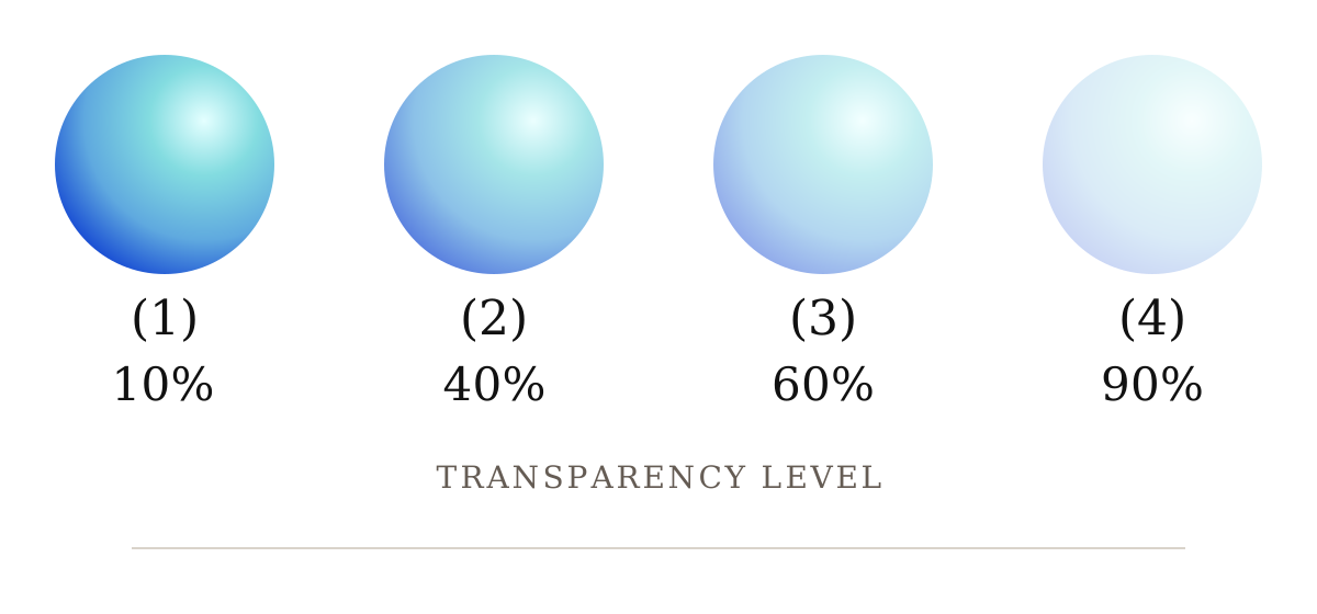
Developed during my master's studies in landscape architecture at the Virtual Landscape Design Lab at Istanbul Technical University, this published study examines how transparent objects are perceived in VR head-mounted displays. The research addresses a practical problem in immersive architectural and landscape visualization: transparent materials such as glass have few conventional texture cues, so colour, luminance, and opacity become unusually important to how users judge depth and interact with an object.
Research Design
The experiment used two simple 3D spheres, each 7.5 centimetres in radius and presented 50 centimetres from the participant in Unreal Engine 4.27. Sixty participants completed a within-subject forced-choice pairwise comparison experiment across four transparency levels (10%, 40%, 60%, and 90%), six hues (red, magenta, yellow, green, blue, and cyan), and two luminance conditions. A Latin-square presentation order reduced learning and fatigue effects. Using an Oculus Quest 2 controller, participants selected which of two otherwise equivalent spheres appeared nearer; each participant completed 264 comparisons across the four transparency conditions.
Paper Figures
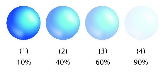
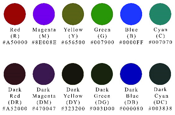
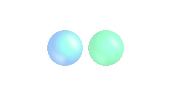
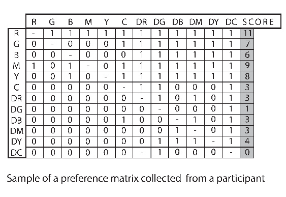
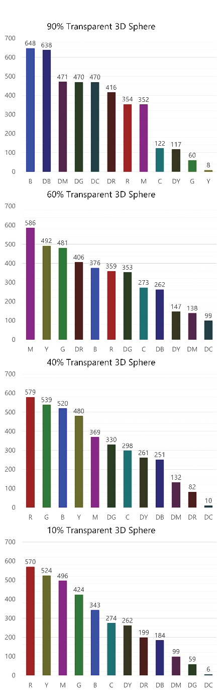
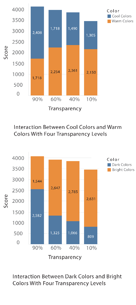
Original figures from the published paper: experimental conditions, pairwise-comparison data, and aggregated results. Select any figure to view it at full size.
Findings
Preference matrices were evaluated with Kendall's coefficients of agreement and consistency. At 10% and 40% transparency, the results broadly followed classical depth-cue expectations: warm colours tended to appear nearer than cool colours, and bright colours nearer than dark ones. At 60% and especially 90% transparency, those relationships reversed. Cool colours were perceived as nearer than warm colours, while dark colours were perceived as nearer than bright colours. At 90% transparency, blue received the highest score and bright yellow the lowest, demonstrating that opacity changes the meaning of familiar pictorial depth cues.
Contribution and Limitations
The findings give VR, architectural visualization, and virtual landscape designers a practical basis for choosing colour and luminance when transparent objects need to remain spatially legible. They also caution against transferring assumptions from opaque graphics directly into highly transparent HMD scenes. The study examined four transparency levels, twelve colour/luminance conditions, and a white background; different palettes, backgrounds, object geometries, or transparency intervals may produce different effects. The paper was published in the proceedings of eCAADe 41 in 2023 and continues to inform my work on perceptual clarity in spatial computing.